
Introduction
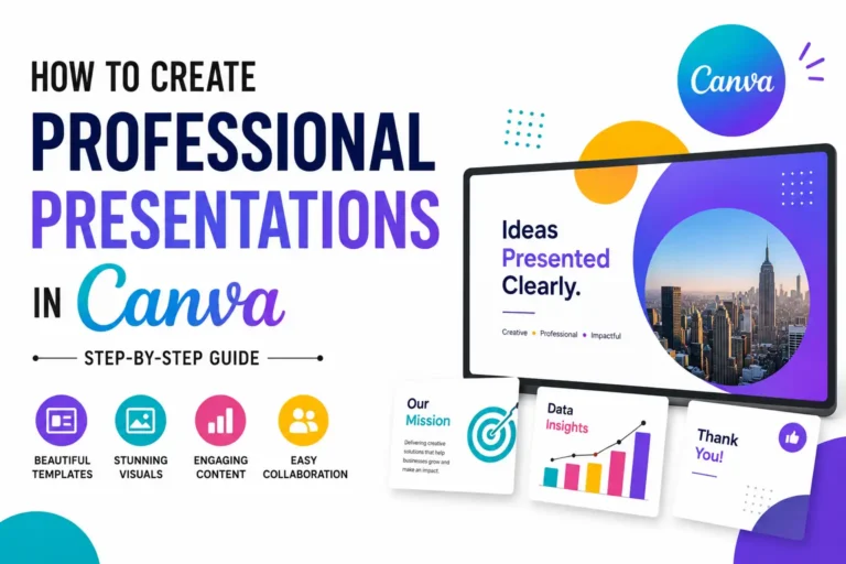
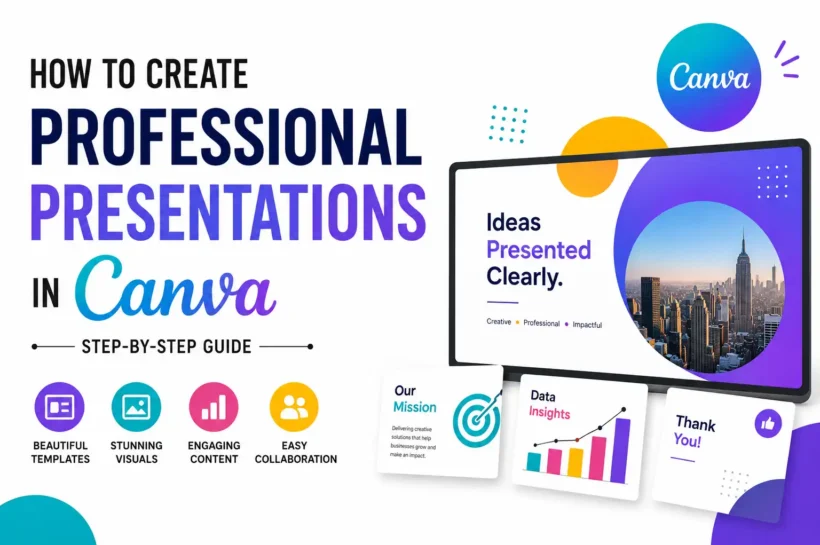
Creating a professional presentation is no longer limited to designers or people with advanced software skills. Canva has made presentation design accessible to everyone through its intuitive drag-and-drop editor, professionally designed templates, AI-powered tools, and collaboration features. Whether you’re preparing a business pitch, sales proposal, classroom lesson, marketing strategy, or conference presentation, Canva provides everything you need in one platform. According to Canva, more than 220 million monthly active users use the platform worldwide, making it one of the most trusted visual communication tools available. In this step-by-step guide, you’ll learn how to create polished, engaging, and visually impressive Canva presentations that capture attention, communicate ideas clearly, and leave a lasting impression.
Create Professional Canva Presentations in Simple 8 Steps
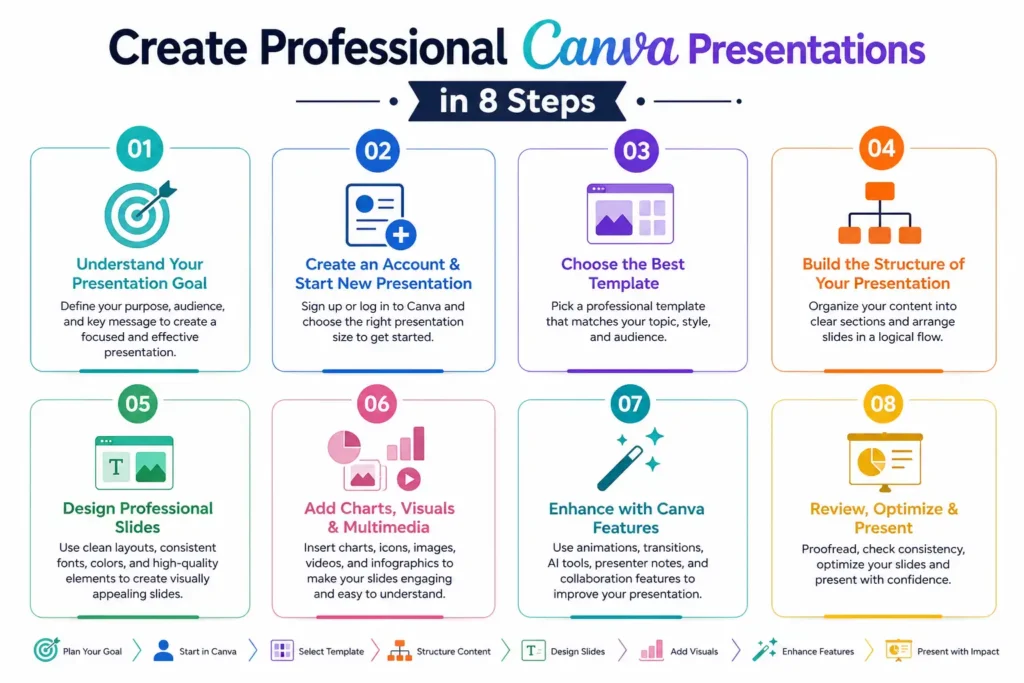
Step 1: Understand What Makes a Professional Presentation
Before opening Canva, it’s important to understand what separates an average presentation from a professional one. A high-quality presentation does more than display information it tells a clear story, keeps the audience engaged, and supports your message with clean visuals. Professional presentations focus on readability, consistency, and purposeful design rather than excessive animations or cluttered slides. Research published by the University of Minnesota found that well-designed visuals significantly improve audience comprehension and information retention. By understanding these design fundamentals first, you’ll make better decisions throughout the entire presentation creation process.
Step 2: Create a Canva Account and Start a New Presentation
Getting started with Canva only takes a few minutes, but making the right choices early can improve your presentation quality. After creating a free account, you’ll gain access to templates, design assets, collaboration features, and cloud storage. Choosing the correct presentation type, slide dimensions, and workspace at the beginning helps maintain consistency throughout your project. Planning these basics before designing saves editing time and creates a smoother presentation-building experience from start to finish.
Step 3: Choose the Best Canva Presentation Template
Instead of designing every slide from scratch, Canva offers thousands of professionally created templates for business, education, healthcare, finance, technology, and marketing. The best template matches your audience, purpose, and brand identity while maintaining readability and consistency. Choosing an appropriate design also reduces editing time because fonts, layouts, colors, and slide structures are already professionally organized. A well-selected template helps you focus more on delivering valuable content than fixing design problems.
🎯 More Helpful Guides: 10 AI Use Cases Every HR Team Should Know in 2026
Step 4: Build the Structure of Your Presentation
A successful presentation follows a logical structure that guides the audience from introduction to conclusion without confusion. Before adding detailed content, create an outline that organizes your ideas into meaningful sections. Each slide should introduce one main concept and naturally connect to the next. Presentation experts often recommend following a storytelling approach because narratives improve audience engagement and information retention. Building your slide sequence first makes it easier to maintain flow, reduce repetition, and create a presentation that feels organized, persuasive, and easy to follow.
Step 5: Design Professional-Looking Slides in Canva
Design is what transforms information into an engaging presentation. Effective slide design balances text, images, colors, typography, and spacing to improve readability while supporting your message. Rather than filling every slide with content, focus on simplicity and visual consistency. Studies by Microsoft suggest that clean, visually organized content helps maintain audience attention more effectively than cluttered layouts. Canva’s design tools make it easy to align elements, apply consistent branding, and create visually appealing slides that look polished across business, education, and marketing presentations.
Step 6: Add Charts, Visuals, and Multimedia
Visual content plays a major role in making presentations more engaging and easier to understand. Instead of relying on text-heavy slides, use charts, icons, images, videos, and other multimedia elements to communicate information more effectively. Research from the 3M Corporation found that visuals are processed significantly faster than text, helping audiences understand complex ideas more quickly. Canva offers a large library of professionally designed graphics, stock photos, videos, icons, and data visualization tools that help transform ordinary slides into visually compelling presentations while maintaining a clean and professional appearance.
🎯 More Helpful Guides: Best 12 Unique Business Ideas to Start in 2026
Step 7: Enhance Your Presentation with Canva Features
Once your slides are complete, Canva provides several advanced features that improve both design quality and presentation delivery. AI-powered tools, animations, presenter mode, collaboration, and cloud-based editing help create a smoother workflow while producing more polished results. These features save time, maintain consistency, and improve audience engagement. Whether you’re presenting in person or online, Canva’s built-in capabilities allow you to refine your presentation without requiring advanced graphic design experience or additional presentation software.
Step 8: Review, Edit, and Optimize Your Presentation
Before presenting your work, take time to carefully review every slide for design consistency, content accuracy, and overall readability. Even small mistakes can reduce professionalism and distract your audience. A thorough review helps identify formatting issues, spelling errors, inconsistent layouts, or weak visual hierarchy before the final presentation. Many communication experts recommend reviewing presentations multiple times and testing them on the device you’ll use during delivery. This final optimization step ensures your Canva presentation looks polished, functions properly, and delivers a strong impression.
Best Design Practices for Creating Professional Canva Presentations
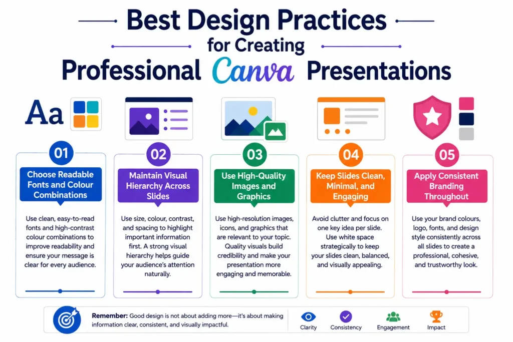
Strong design principles are the foundation of every successful presentation. Even with Canva’s professional templates and AI tools, thoughtful design decisions make the biggest difference in how your message is received. Effective presentations combine readability, consistency, visual balance, and purposeful graphics to guide the audience naturally through the content. Rather than decorating slides with unnecessary elements, focus on clarity and communication.
Choose Readable Fonts and Colour Combinations
Select fonts that are easy to read from a distance and limit your presentation to two or three typefaces. Pair them with high-contrast colour combinations to improve visibility across different screens. Consistent typography and accessible colour choices ensure your audience can comfortably read every slide without unnecessary visual strain.
Maintain Visual Hierarchy Across Slides
Visual hierarchy directs the audience’s attention to the most important information first. Use larger headings, smaller supporting text, strategic spacing, and consistent alignment to organize content logically. Maintaining the same hierarchy across every slide creates a predictable reading experience and helps viewers understand your message more efficiently.
Use High-Quality Images and Graphics
Professional presentations rely on clear, high-resolution visuals that reinforce the content rather than distract from it. Use relevant photos, icons, illustrations, and charts that match your topic and audience. Consistent image quality strengthens credibility and helps explain ideas that may be difficult to communicate through text alone.
Keep Slides Clean, Minimal, and Engaging
Focus on one primary idea per slide, use concise text, and leave sufficient white space around content. Minimalist slides improve readability, maintain audience attention, and allow presenters to explain concepts naturally instead of reading directly from the screen.
Apply Consistent Branding Throughout
If you’re creating presentations for a company or organization, maintain consistent branding from the first slide to the last. Use the same logo placement, brand colours, typography, and design style throughout the presentation. Consistent branding builds trust, strengthens brand recognition, and gives your presentation a polished, cohesive, and professional appearance.
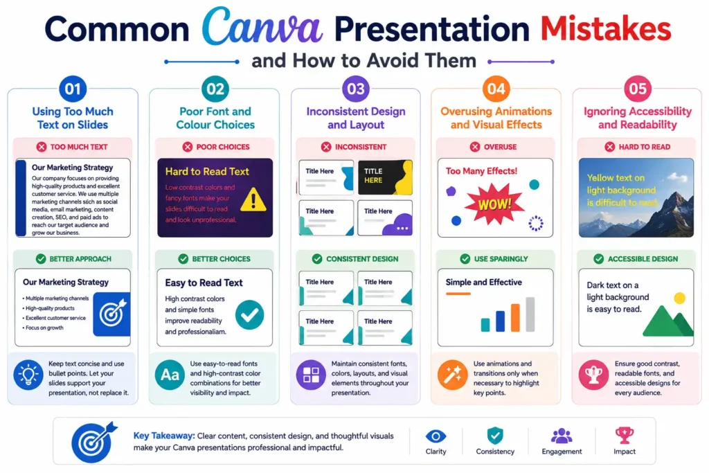
Common Canva Presentation Mistakes and How to Avoid Them
Using Too Much Text on Slides
One of the most common mistakes is filling slides with lengthy paragraphs. Slides should support your presentation not replace your speech. Keep text concise by using short bullet points, keywords, and brief statements. This approach helps your audience stay focused on your explanation instead of reading large blocks of text, making your presentation easier to follow and more engaging.
Poor Font and Colour Choices
Using decorative fonts or low-contrast colour combinations reduces readability and makes presentations appear unprofessional. Choose simple, easy-to-read fonts and maintain strong contrast between text and background colours. Consistent typography and a limited colour palette create a cleaner design while ensuring your content remains accessible to every audience member.
Inconsistent Design and Layout
Switching fonts, colours, layouts, or image styles between slides creates an unorganized appearance. Maintain consistent spacing, alignment, headings, and visual elements throughout the presentation. Canva templates and Brand Kit features help establish a unified design that improves professionalism and creates a smoother viewing experience from beginning to end.
Overusing Animations and Visual Effects
Animations should highlight important information rather than distract the audience. Applying multiple transition styles or excessive movement can reduce the presentation’s impact. Use subtle animations only where they add value, such as introducing key points or emphasizing data. A clean presentation with minimal effects often appears more polished and professional.
Ignoring Accessibility and Readability
Professional presentations should be accessible to all viewers. Use readable font sizes, high colour contrast, descriptive charts, and simple language whenever possible. Avoid relying solely on colour to communicate meaning. Designing with accessibility in mind improves comprehension and ensures your presentation reaches a wider audience, including people with visual impairments.
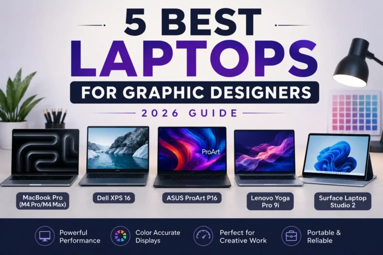
🎯 More Helpful Guides: 5 Best Laptops for Graphic Designers in 2026
Expert Tips to Create Outstanding Professional Presentations in Canva
Creating a visually attractive presentation is only part of the process. Outstanding presentations combine effective storytelling, strategic design, consistent branding, and audience-focused communication. Small improvements in structure and delivery can dramatically increase engagement and information retention. Many professional speakers and business leaders follow proven presentation techniques to make their slides more persuasive and memorable. Applying these expert tips will help you maximize Canva’s design capabilities while creating presentations that look polished, communicate clearly, and leave a lasting impression in both professional and educational settings.
Build a Storytelling Presentation Structure
Organize your presentation like a story with a clear beginning, middle, and conclusion. Introduce the topic, explain the challenge, present your solution, and finish with key takeaways or recommendations. Storytelling creates a logical flow that keeps audiences engaged while making complex information easier to understand and remember.
Follow the 6×6 Rule for Slide Content
A widely used presentation guideline is the 6×6 Rule, which recommends using no more than six bullet points per slide and approximately six words per bullet whenever practical. This keeps slides uncluttered and encourages presenters to explain ideas verbally instead of reading directly from the screen.
Use Brand Colours and Consistent Typography
Maintain the same brand colours, fonts, and design style throughout every slide. Consistent branding strengthens recognition, improves credibility, and creates a more professional appearance. Canva’s Brand Kit helps you keep every presentation consistent by automatically applying your organization’s colors, fonts, and logos for a polished, professional appearance.
Optimise Slides for Virtual and In-Person Presentations
Presentations should perform well whether viewed in a meeting room or during a virtual conference. Use bold typography, high-resolution visuals, and strong color contrast to ensure your content stays clear and easy to read on screens of all sizes. Test your slides on multiple devices to ensure graphics, videos, and layouts display correctly in every presentation environment.
Final Presentation Checklist Before Delivery
Before presenting, review every slide for spelling, grammar, alignment, consistency, and visual balance. Confirm that animations, hyperlinks, videos, charts, and transitions work properly. Practice your presentation several times to improve timing and confidence. A final quality check helps eliminate last-minute issues and ensures a smooth, professional delivery.
Frequently Asked Questions (FAQs)
Is Canva good for professional presentations?
Yes. Canva is widely used by businesses, educators, marketers, startups, and freelancers to create professional presentations.
Can Canva presentations be converted to PowerPoint?
Yes. Canva allows you to download presentations in Microsoft PowerPoint (.PPTX) format. This makes it easy to continue editing in PowerPoint or present offline while preserving most layouts, graphics, and design elements. Reviewing the exported file before presenting is recommended to ensure formatting remains consistent.
Is Canva Free enough for professional presentations?
For many users, Canva Free provides more than enough features to create high-quality presentations. It includes thousands of templates, graphics, photos, and collaboration tools. Canva Pro offers additional benefits such as premium templates, Brand Kit, Magic Resize, AI features, and a larger media library for users who create presentations regularly.
Can multiple people edit a Canva presentation together?
Yes. Canva supports real-time collaboration, allowing multiple team members to edit the same presentation simultaneously. Users can share comments, assign feedback, and make live updates from different locations. This collaborative workflow helps teams work more efficiently while reducing version control issues.
What is the ideal number of slides for a presentation?
There is no fixed number because it depends on your topic, audience, and presentation length. For a standard 15–20 minute presentation, around 10 to 20 slides is generally sufficient. Focus on communicating one main idea per slide rather than trying to meet a specific slide count.
🎯 More Helpful Guides: How to Make Your Chrome Faster (10 Proven Tips)
Conclusion
Creating professional presentations in Canva is much easier when you follow a structured process and apply proven design principles. From choosing the right template and organizing your content to adding visuals, using Canva’s advanced features, and reviewing every slide carefully, each step contributes to a stronger final presentation. By avoiding common mistakes and following expert recommendations, you can produce presentations that are visually appealing, easy to understand, and highly engaging. Whether you’re preparing a business proposal, educational lecture, marketing report, or client pitch, Canva provides the tools needed to create presentations that communicate your message with confidence and professionalism.
📱 Tech trends, simplified. Follow Tech Fueler for more.